How to add a feedback button to your website (step-by-step)
What’s in this article
- Comparison table — three implementation methods
- What is a website feedback button?
- Method 1: JavaScript snippet (5 minutes)
- Method 2: WordPress plugin
- Method 3: No-code tools
- Feedback button UI best practices
- Where to place the feedback button
- How to customize the feedback button for your use case
- How to manage and act on the feedback you receive
- What happens after someone clicks submit?
- FAQ
A feedback button on a website is a persistent UI element that lets visitors, testers, and clients submit structured feedback without ever leaving the page. The fastest way to add one: paste a JavaScript snippet before the closing </body> tag — the button appears immediately, and every report automatically includes a screenshot, browser data, page URL, and console logs. No email chains. No vague "the button’s broken" notes. No follow-up questions.
There are three ways to implement it — JavaScript snippet, WordPress plugin, or no-code embed — depending on how your site is built. This article walks through all three, plus placement rules and what happens to the reports once they land. Tools like Ybug make this a 5-minute setup.
Key takeaways:
- A feedback button is a persistent UI element that lets visitors report bugs and share feedback — with automatic screenshot, browser data, and console logs — without leaving the page.
- Three ways to add one: JavaScript snippet (~5 min) — vanilla JavaScript or dedicated Vue, React, and Angular npm packages for framework projects, WordPress plugin (~2 min), or no-code embed (~1 min on Webflow, Bubble, Wix, Squarespace).
- Best placement: Vertical side tab on the right edge — always visible, never in the way.
- Every report includes: annotated screenshot, browser/OS info, screen resolution, page URL, and console logs. No follow-up questions needed.
- Tools like Ybug handle the full setup and push reports straight to Jira, Trello, Asana, or Slack.
Comparison table — three implementation methods
| Method | Technical knowledge | Setup time | Best for | What you can configure | Limitations |
| JavaScript snippet | Basic HTML | ~5 minutes | Any website, framework, or custom build (dedicated Vue, React, and Angular npm packages available) | Button position, color, label, audience targeting, user role conditions, URL-based targeting, pre-filled reporter info | Requires access to the site’s codebase or template files |
| WordPress plugin | None | ~2 minutes | WordPress sites | Button visibility by page type, post type, or logged-in user role | WordPress only; some advanced targeting requires manual snippet edits |
| No-code embed | None | ~1 minute | Webflow, Bubble, Framer, Wix, Squarespace | Site-wide or per-page placement depending on platform | Platform must support custom code injection; Bubble requires marketplace plugin |
What is a website feedback button?
A website feedback button is a persistent, always-visible element on your site that opens a feedback form when clicked. Unlike contact forms (which are buried in menus) or user surveys (which interrupt the session), a feedback button sits out of the way until someone needs it — then opens in place without navigating away from the page.
What it captures depends on the tool. A basic feedback button might collect a text message and an email address. A more capable website feedback widget captures the full context automatically: a screenshot of the current page state (with annotation tools), the browser and OS version, screen resolution, page URL, and JavaScript console logs — all without the user lifting a finger to provide that information.
The difference matters enormously for development teams. A feedback report with "the checkout button doesn’t work" is a conversation starter. A report with an annotated screenshot, Chrome 121 on macOS 14, and a console error pointing to a specific JavaScript exception is a ticket a developer can act on immediately — which is exactly what a dedicated bug reporting widget is designed to deliver.
Method 1: JavaScript snippet (5 minutes)
The fastest way to add a feedback button to any website is a JavaScript snippet — a few lines of code that load the widget on every page. You can also do it with Google Tag Manager.
Using Ybug:
- Sign up for a free account and create a new project
- Copy the JavaScript snippet from your project settings
- Paste it before the closing
</body>tag on every page (or in your site’s global footer template)
<!-- Ybug feedback widget -->
       <script>
         window.ybug_settings = {"id":"YOUR_PROJECT_ID"};
         (function() {
           var ybug = document.createElement('script');
           ybug.type = 'text/javascript';
           ybug.async = true;
           ybug.src = 'https://widget.ybug.io/button/' + window.ybug_settings.id + '.js';
           var s = document.getElementsByTagName('script')[0];
           s.parentNode.insertBefore(ybug, s);
         })();
       </script>
That’s it. The feedback button appears automatically on the page. Visitors and testers can click it, annotate a screenshot, describe the issue, and submit — with browser, OS, resolution, page URL, and console logs captured automatically in every report.
Using a JavaScript framework? If you’re building with Vue, React, or Angular, you can install Ybug’s dedicated npm packages instead of pasting the raw snippet. They provide framework-native components that handle initialization and cleanup automatically — no manual script injection needed. See the installation docs for setup instructions for each framework.
To show the button only on specific pages or for specific users (e.g., only on a staging environment, or only when a user is logged in as a tester), wrap the snippet in a conditional:
<script>
         if (window.location.hostname === 'staging.yoursite.com') {
           window.ybug_settings = {"id":"YOUR_PROJECT_ID"};
           // rest of snippet
         }
       </script>
Ybug also supports audience targeting — showing the widget only on specific URLs, to specific user roles, or during specific phases of a project.
Method 2: WordPress plugin
If your site runs on WordPress, you don’t need to touch code. Ybug has a dedicated WordPress plugin that handles the snippet installation from the dashboard.
Steps:
- In your WordPress admin, go to Plugins > Add New
- Search for "Ybug"
- Install and activate the plugin
- Go to Settings > Ybug and paste your Project ID
- Choose where the button appears — all pages, specific post types, or logged-in users only
The plugin handles all the snippet loading automatically. You get the same full-context feedback capture as the manual snippet method — browser data, screenshots, console logs — without editing any theme files.
Method 3: No-code tools
If you’re building on a no-code platform — Webflow, Bubble, Framer, Wix, or Squarespace — you can still add a feedback button using the custom code embed options most platforms provide.
Webflow: Paste the Ybug snippet into Project Settings > Custom Code > Footer Code. It applies site-wide automatically.
Bubble: Use the Ybug plugin available in the Bubble marketplace. No manual code required.
Framer / Wix / Squarespace: Use the platform’s custom code section (usually in site settings or page settings) to paste the snippet into the page footer.
Feedback button UI best practices
The best feedback button UI is one that’s easy to find when needed but doesn’t interrupt the experience when it’s not.
Position and visibility
Side tab (vertical, right edge) is the most common and most effective placement. It’s visible at all times without overlapping content, and the right edge is where users expect to find utility controls. The label — "Feedback," "Report a bug," or "Help" — should be short and action-oriented.
Floating button (bottom corner) works well for apps and dashboards where a side tab would conflict with the layout. Keep it in the bottom-right corner (away from cookie banners and live chat widgets).
Avoid top placements. The top of the page is prime real estate for navigation. A feedback button there competes with the UI your users need to actually use the product.
Color and contrast
The button should be visible without being disruptive. A color that contrasts with the page background but doesn’t clash with your brand palette works well. Avoid red — it signals errors or warnings to most users, which isn’t the tone you want for a general feedback mechanism.
Label text
- For general feedback: "Feedback" or "Share feedback"
- For bug reporting: "Report a bug" or "Found an issue?"
- For client review: "Leave a comment" or "Review this page"
Match the label to the context. A QA testing environment should be more explicit ("Report a bug") than a live production site ("Feedback").
Where to place the feedback button
On staging environments: Show the button on every page — it’s the primary feedback channel during review and testing. Make it prominent.
On production for internal teams: Show it only to logged-in users with specific roles (admins, internal testers). Use the audience targeting or user role conditions in your widget settings. This is especially useful for agencies that manage live client sites and need an internal review channel without exposing the widget to all visitors.
On production for end users: A feedback button for general user feedback should be subtle but accessible. Avoid showing it during critical user flows (checkout, form submission) where it might create distraction or confusion. Startups collecting early user feedback often benefit from showing the button on specific beta features rather than site-wide.
On specific pages only: If you want feedback only on certain sections of your site — a new feature, a redesigned page, a beta section — use URL-based targeting to limit where the button appears.
The feedback button's job is to make it as easy as possible for the right person to report the right thing at the right moment. We keep ours on every page — because you never know where a bug or a great idea will surface.
How to customize the feedback button for your use case
A default feedback button works out of the box, but most teams benefit from at least a few customizations that match their context and audience.
Customizing for internal QA vs. client review
The feedback form that works for an internal QA tester isn’t the same one that works for a client. QA testers understand fields like "severity" and "steps to reproduce." Clients don’t — and presenting them with a technical form creates friction that leads to abandoned submissions.
Ybug supports separate form configurations for different contexts. For internal QA testing use, you can enable fields for severity, category, and reproduction steps. For client-facing review environments, a simpler form — just a description and optional screenshot annotation — removes friction and gets more feedback submitted.
Branding and appearance
The default Ybug widget uses neutral styling that works on most sites. For client-facing staging environments, matching the widget color to the project’s brand palette makes the tool feel like part of the experience rather than an add-on. Button position, label text, and color are all configurable in the Ybug dashboard without touching code.
Pre-filling reporter information
If your staging environment has user authentication, you can pass the logged-in user’s name and email to the widget automatically so reporters don’t have to enter their details manually. This also means every report is attributed to a specific reviewer — useful when you’re managing feedback from multiple clients or stakeholders in the same project.
How to manage and act on the feedback you receive
Adding a feedback button is the easy part. The harder part is making sure the reports that come in are reviewed, triaged, and acted on in a way that closes the loop for reporters.
Set up a triage process before you share the staging link. Decide in advance who reviews incoming feedback, how often, and what the expected response time is. A feedback channel with no defined owner fills up unread.
Acknowledge receipt, especially for client-facing environments. When a client submits feedback through a widget, a brief acknowledgment — even a simple "we’ve logged your note and will review it" — prevents the duplicate submissions that happen when people aren’t sure if their feedback went through.
Link resolved feedback to the original report. When a bug is fixed, close or resolve the corresponding ticket and note what was done. This creates a transparent record of what was changed and when — useful for final sign-off meetings and post-launch retrospectives.
Use feedback data to spot patterns. If the same area of the site generates five separate reports across different reviewers, that’s a signal worth acting on even if each individual report seems minor. The customer feedback dashboard in Ybug lets you see all reports in one place — making patterns visible that would be invisible across scattered emails.
What happens after someone clicks submit?
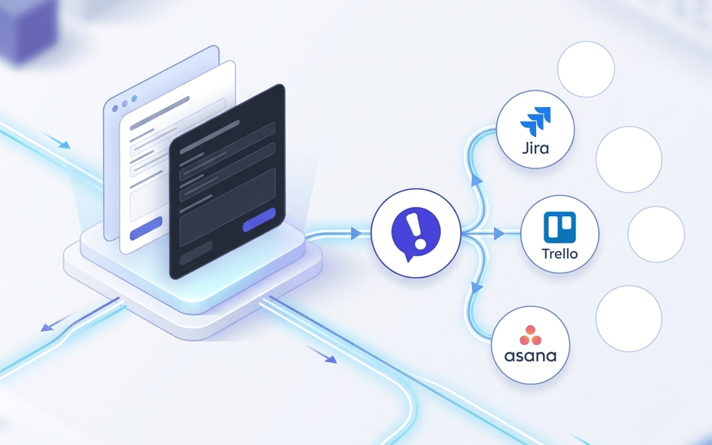
When a user submits feedback through the website feedback tool, the report is sent to your Ybug project dashboard and — depending on your integrations setup — pushed automatically to Jira, Trello, Asana, GitHub, Slack, or your preferred tool.
Each report includes:
- The reporter’s annotation and description
- A screenshot of the page at the moment of submission
- Browser name and version
- Operating system
- Screen resolution
- Page URL
- JavaScript console logs (errors and warnings)
- Timestamp
No follow-up needed. No "what browser were you using?" No reformatting for the issue tracker. The report arrives as a developer-ready ticket.
